Back to Basic: Playful, Simplicity and
Functionality
Tiny House
Nederland
Visual Identity
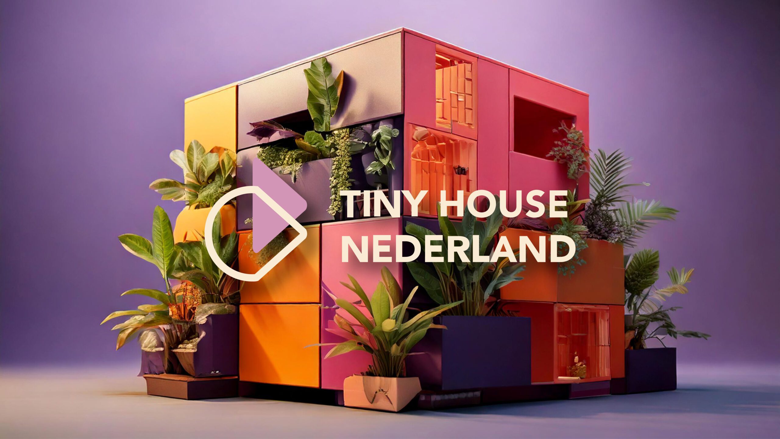
Tiny House Nederland promotes a mindful lifestyle centered around simplicity and efficiency. For this organization, Krul Creative designed a bold visual identity inspired by the Memphis art style. Known for its playful geometric shapes, vibrant colors, and the balance of simplicity and complexity, Memphis perfectly aligns with the core values of tiny house living.
Both Tiny Houses and the Memphis style share the philosophy of returning to basics, focusing on functionality without sacrificing style. Krul Creative developed a visual identity that reflects these values, strengthening the brand of Tiny House Nederland.
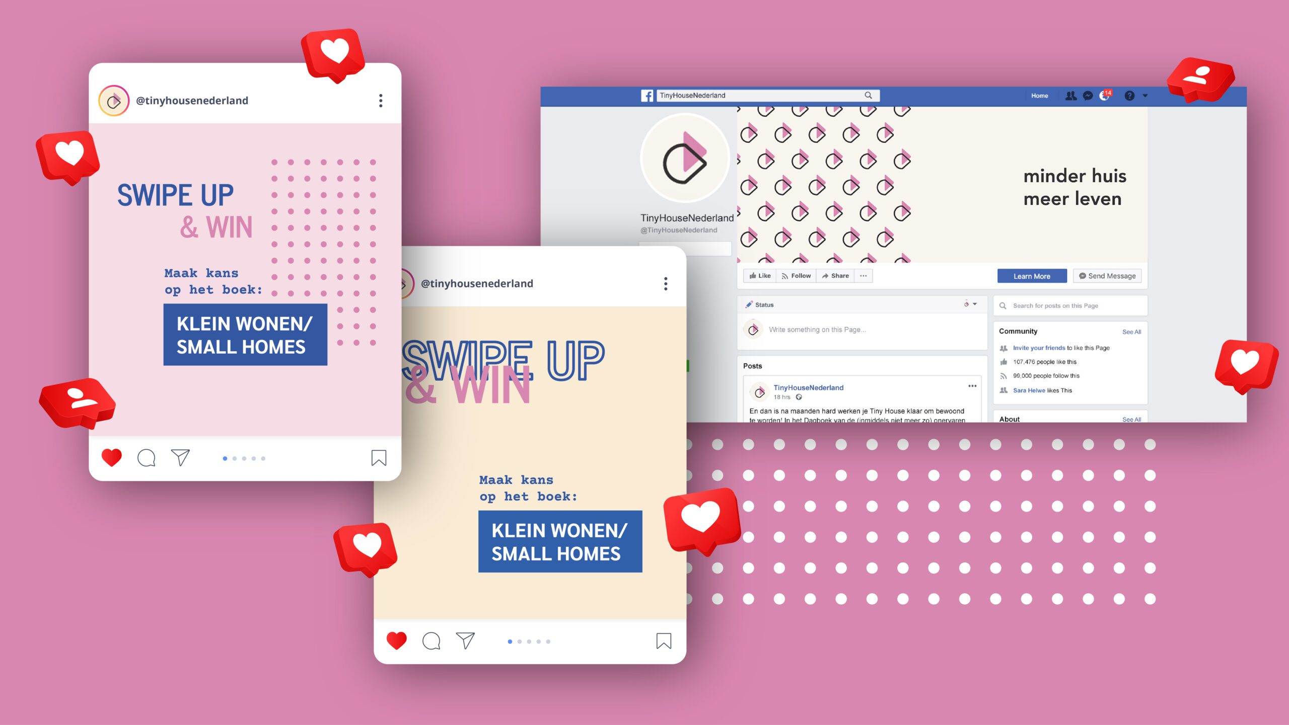
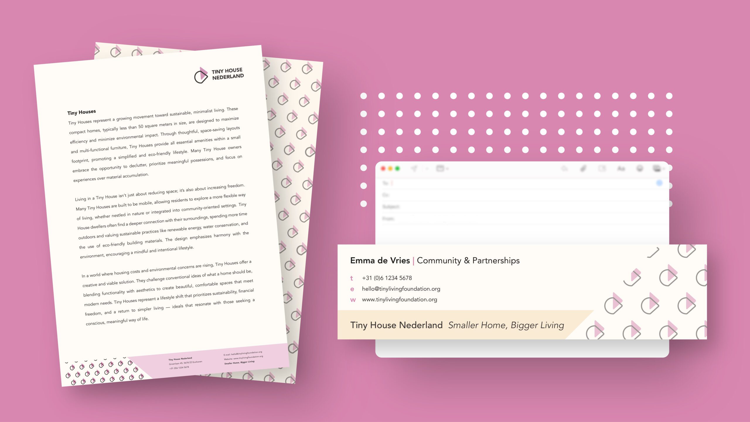
The result is a vibrant identity featuring a cheerful pink tone and playful shapes. In addition to the logo, we designed social media posts, a social media banner, posters, and an email footer—each with a clear, consistent look that aligns perfectly with the mission of Tiny House Nederland.